
Raise your hand if you kind of glazed over the word monochromatic because if you thought about it long enough you’d know what it means but it’s been a long day and that takes too much effort. By the way count me in. I’m definitely in the camp of skipping over words I don’t use frequently.
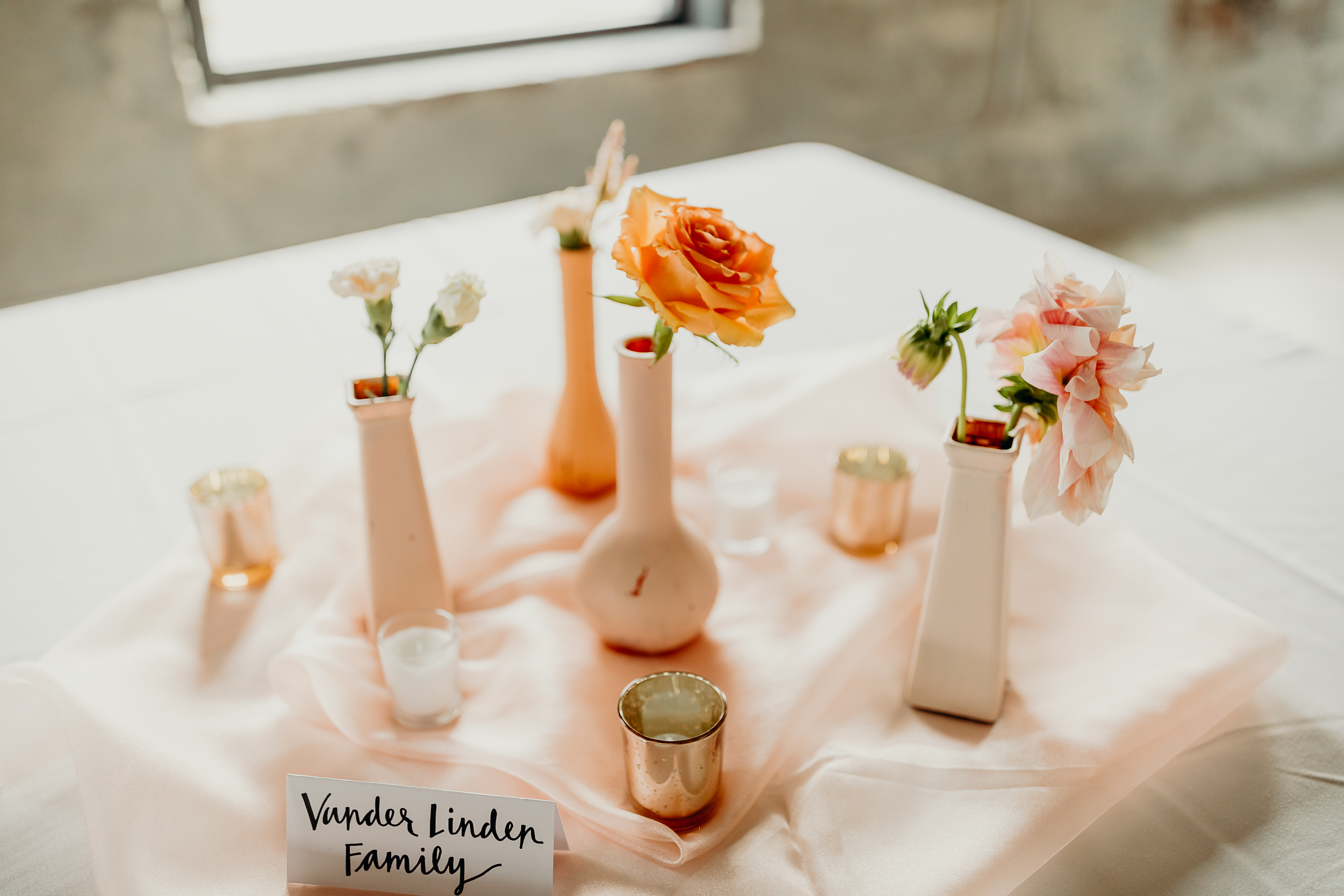
Ok, so let’s start over – monochromatic basically means all the same. I created these somewhat monochromatic clay pots with pots, pitchers, and vases I got from garage sales, secondhand stores, and the Dollar Tree. I didn’t pay more than $8 for any of the pots you see below – most were less than $5.
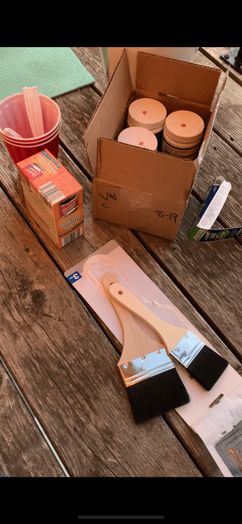
Here’s what you’ll need:
-literally any pot, pitcher, or vase. It can be glass, metal, plastic…anything.
-sample of oil-based paint (like what you get at Lowe’s)
-baking soda
-supplies include: plastic spoons, plastic cups, paint brushes, paper bags or some kind of spill cloth
Here’s what you’ll do:
-Buy several paint samples. In order to get the “monochromatic look,” buy different shades of the same color or within the same color palette.
-Get your painting station set with paper bags, plastic cups for mixing, spoons, baking soda, paint brushes, and the paint.
-Mix 1 teaspoon baking soda with every 1/2 cup of paint (or half the 8 oz. sample amount).
-Paint two coats, drying in between. You can save a certain shade of paint by putting aluminum foil over the top of the plastic cup.
-Do any touch ups in the morning and voila!
We’ll use these for random pops of decor in corners, on tables, etc. and put a piece of pampas grass or a palm spear in each. I may sell them afterwards or use them around the house! Play by play pictures below ❤
I got 4 colors from Lowe’s at $4 a piece for almost 8oz (just ask them for a paint sample).

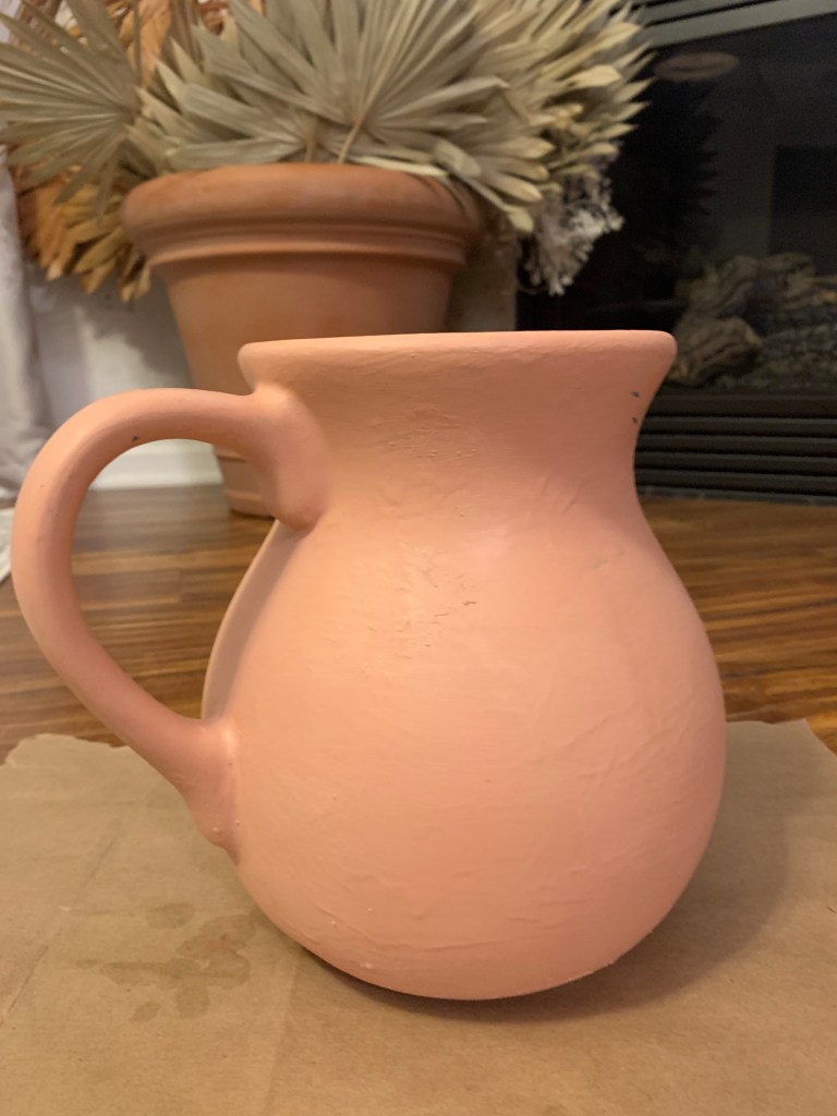
This is what I started with – a $3 pitcher I got at a garage sale. I always told myself (and everyone who asked) that I was going to paint it for the wedding. For awhile I didn’t believe it. But here we are! Thanks, boredom.
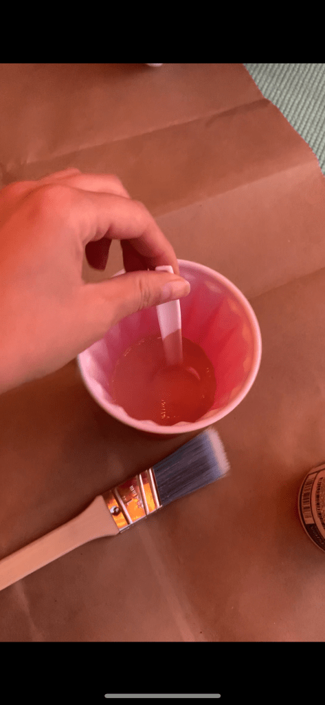
As you can see, I mixed 1 tsp. of baking soda for every 1/2 cup of paint (or 4 ounces, so you’ll pour about half of the paint sample in the cup). This helps give the paint a “matte” look and it will help make it look grainy as well – smooth looks too polished nowadays.
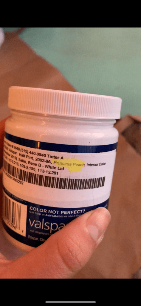
Here’s a pic of the paint I used – Princess Peach by Valspar available at Lowe’s was opaque enough for the blue pitcher!
You’ll want to do two coats and don’t be discouraged if your dried paint cracks a little and you need to do touch ups.

I wanted to show a picture of another vase I painted for you all to see that clear glass works fine as well.
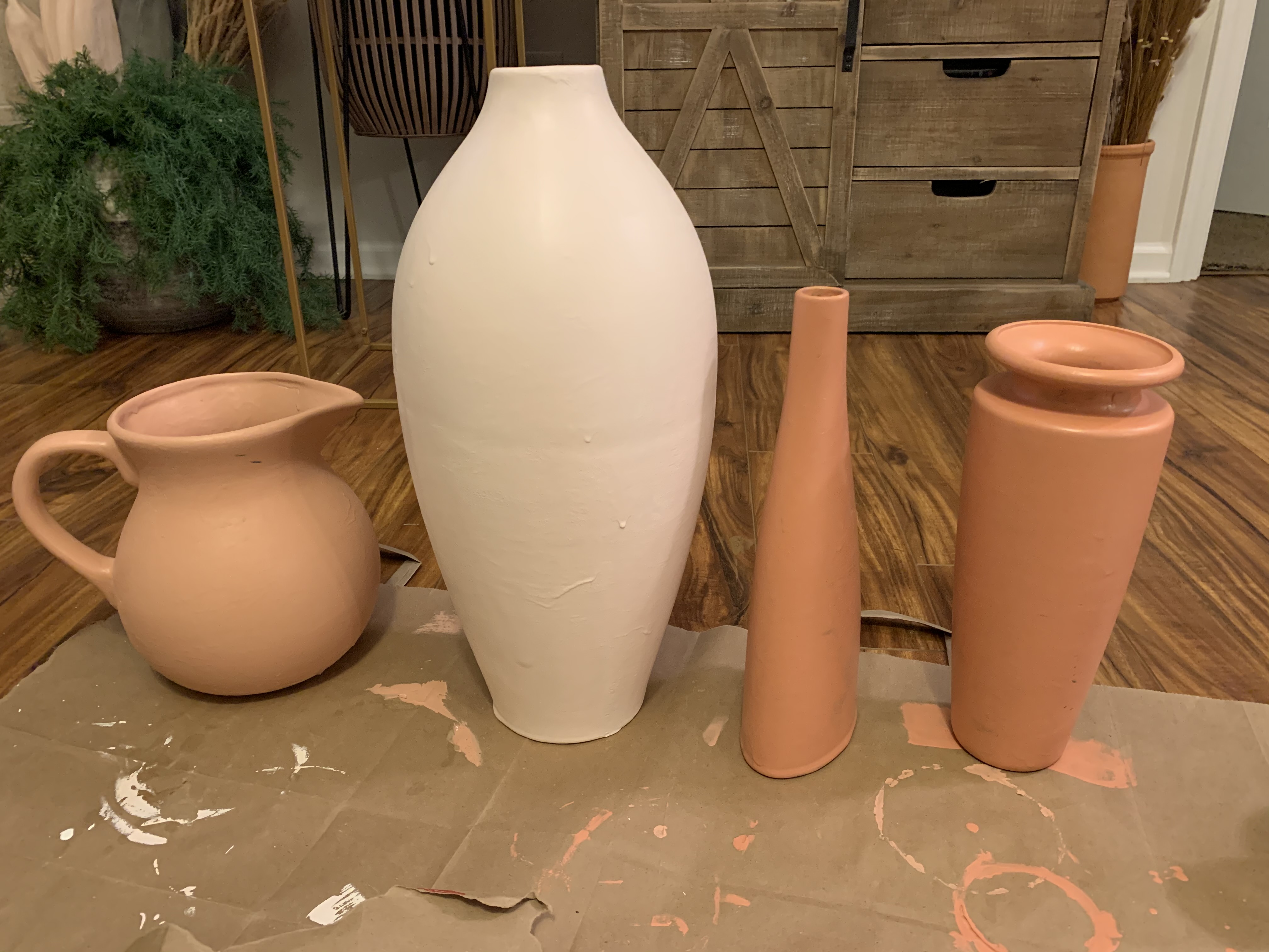
Pictured are four I did because it’s kind of therapeutic and addicting. I kept going with some Dollar Tree vases I got as well. The paints shown here are Princess Peach, a mix between a white sample and Terra-Earth (Valspar) that is heavy on the white and very light on the terra-earth color, and Terra-Earth is the paint color on the end. I’ll upload updates as I do more and from the wedding soon. xx
